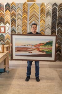
We've moved! Find us at 238 Bridge st, Northampton
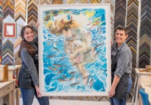
Keeping Our Heads Above Water: Paintings by Susan Valentine
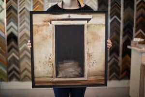
Hope & Feathers Framing and Gallery hosts “Keeping Our Heads Above Water”, paintings by Leverett artist Susan Valentine, January 18th through February 25th.
Late this past summer, Susan acquired a kayak. She explains:
“Leverett Pond is a tiny walk from my studio. On the pond, I was inspired to slow down. I spent many a day on the water’s surface, tooling around and being nurtured by the views, the creatures, the plant life.
These vertical canvases arose from those experiences. I used my phone for reference photos… Inspiration for the format of these paintings. I liked the way this vertical view led me from the plant life below my boat all the way to the sky. Some of these paintings are collaged interpretations and others are representative of what I really saw.
Since November 8th I have been in a state of confusion/depression. I’ve been transported to the promise of a nation I don’t recognize, force fed by a faction which voted, in desperation, humanity’s dark side. I found myself locked in a downward spiral; feeling helpless and useless. Feeling less than my usual self and far less than contented.
Nevertheless, I step up to the canvas again and again. Persistence pays off. November was a tough month. By December, though, I found that my heart had lifted a touch… And once again I began to be nurtured by the act of painting pictures. There is power in making one’s own happiness and I began to feel more positive, more awake and more myself.
I hope that something of the ease I find in this process is transmitted to the viewer. And out of that respite, activists may return to the job at hand more effectively, renewed by having spent some time with my first summer on the pond.”
Susan’s intention is this exhibit be a respite from what is likely the most important issue of our political/social times. She’d like people to feel that they’re in good company here in the valley, and that the job ahead of us is paramount but we need to take care of ourselves to be effective.
A reception will be held on Thursday, February 2nd, in conjunction with Amherst Arts Night Plus, from 5pm to 8pm.
About Susan Valentine
Susan studied first graphic design, then painting at Greenfield Community College. She has held studio space at Leverett Crafts & Arts in Leverett since 2013 and very much enjoys the support of the community of artists there. Her work has been in numerous group and solo shows in western Massachusetts since 2012. www.susanvalentineart.com
RSVP for Artist Reception – February 2nd, 2017
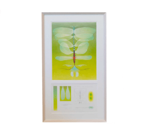
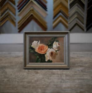
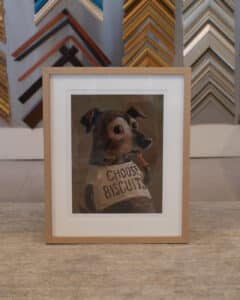
A Sneak Peek…
Jam Side Down: Mosaics by Isabel Margolin
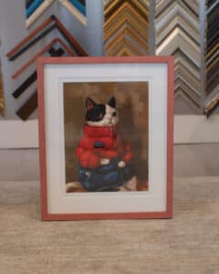
Earthlings: Paintings by Perry Carter
Hope & Feathers Framing and Gallery hosts Earthlings, paintings by Northampton artist Perry Carter, October 6th through 29th
As an artist, Perry is inspired by the unique personality and spirit of her subjects, and she strives to convey what speaks to her, and perhaps amplify some aspect of their individuality through the medium.
Sometimes it’s downy feathers or soft fur juxtaposed with a tough, weathered spirit that ignites her curiosity… or the subtle combination of emotional vacancy and fear flashing in the eyes. Maybe she’s magnetized by the hard angles and dramatic intensity of a creature’s aura, or the evolutionary wonder of the spectacular palettes of wings. Rather than merely capturing a likeness with her brushes, she strives to express something ineffable in her work.
Color, or its absence, is inevitably part of a subject’s unique ‘atmosphere,’ and for her, oils provide the ideal medium. The world teems with fascinating creatures we so rarely take the time to fully appreciate, given today’s nonstop pace, in which doing is valued over being. And yet we are all part of one invisible, sacred web of being. Perry’s paintings are her attempt to explore and convey facets of these worlds-within-worlds.
An opening reception will be held on Thursday, October 6th, in conjunction with Amherst Arts Night Plus, from 5pm to 8pm.
About Perry Carter:
Perry Carter is a self-taught painter with a background in photography and interior design. She primarily works in portraiture, inspired by Earth’s many creatures. Her work has appeared in magazines, newspapers, websites, and CD artwork. She recently received a grant from The Turkeyland Cove Foundation for a painting residency on Martha’s Vineyard. In addition to her painting career, she maintains a private psychotherapy practice in Northampton, Massachusetts, where she lives with her talented musician husband and their two kooky spaniels.
Q&A with Perry
How old were you when you created your first artwork?
My father was an architect and my mother had a degree from RISD in illustration, so I grew up in a family focused on art and design. I picked up photography at a very young age and followed our family pets around taking photos of them. Some of the families in my neighborhood had had professional family portraits taken by a local photographer named Arthur Whitty who liked to shoot in natural lighting with very New England-y settings. I started copying his style, making my 8 year old friends pose against birch trees or stretch out in the grass pretending to be in a field of flowers. It was very corny, but it’s interesting to me now to see how those seeds are still evident in my creative work, through my focus on nature, people, and portraiture.
When did you know you wanted to be an artist?
As young as age 6, I knew I wanted to “find my passion”–something I loved and was good at. I was aware that if you loved your work, life would be much more interesting. I also felt very insecure as the youngest of six children, and wanted reassurance that I had value as a a person because I was “good at something.” So if I tried an art form for fun, I quickly put a lot of pressure on it to be “my passion.” I approached my interests obsessively but also commitment-phobically, like a bachelorette who’s afraid to settle down. It took me a long time to untangle that.
Why did you choose your medium?
I studied writing, music, photography, ceramics, the healing arts, and interior design before discovering painting. I took a break from my psychotherapy practice to pursue interior design training about 6 years ago, and finally took my first drawing and rendering class! We had to learn to convey our interior design ideas using markers and gouache. The teacher was a painter, and somehow I moved from the class assignments to buying canvases and paint. Like my first photographs, my first little painting was of my dog. Something clicked for me about the freedom, simplicity, and privacy that painting offered, which I hadn’t found in other mediums. I started with acrylics and moved on to water-miscible oil paints, which I adore. I have still never taken a painting class!
Where do you work?
I work out of a studio space in my own house. I find it easier to weave painting into the fabric of my life by living where I paint. My husband Russell (“Lord Russ”) is a musician and works out of a studio space in our house as well, so we both prioritize creative expression. I think I might have abandoned painting like everything else if Russell hadn’t been so encouraging of me from the start.
What is your creative process like? How do you work?
The only consistency in my process is that I inundate myself with images while gestating ideas for a new painting. I like to stay inspired, but ideas can come from anywhere, and often have no connection to what I thought I was setting out to do. If I start a new painting and it doesn’t feel right, I might abandon it early on. Other times, I push myself to finish things for the discipline. Sometimes I meditate for guidance on a painting!
What do you like about being an artist in the valley?
Being an “emerging artist” in the valley, I’m still discovering the riches of the art community. I really appreciate the wealth of interesting, creative people here–the writers, musicians, painters, and other artists–and the wide range of opportunities to see or share art in galleries spaces both large and small, humble and prestigious. It’s inspiring to live in a place where so many people prioritize their creative work above material wealth, often living very simply in order to do what they love.