Jul 22, 2016
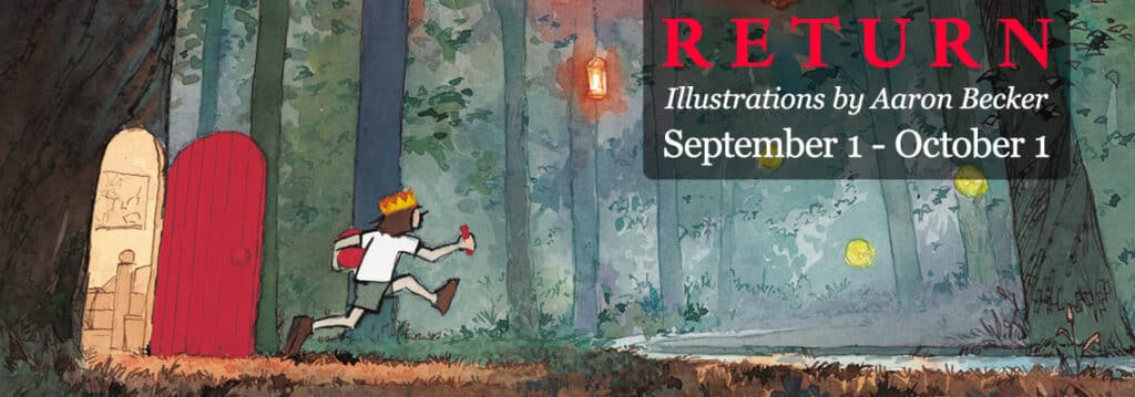
September 1 – October 1, 2016
RETURN to the world of JOURNEY, with an exhibit celebrating the artwork behind the award winning wordless picture book trilogy by local author and illustrator, Aaron Becker. Lauded a “masterwork” by the New York Times and selected as one of the newspaper’s best illustrated books of 2013, JOURNEY went on to win a prestigious Caldecott Honor. The series continued with QUEST in 2014, and this August concluded with RETURN, which debuted at #1 on the New York Times Best Seller List. The show will include original artwork, sketches, artist proofs, and giclée prints from the series.
Prints, original sketches and watercolors, and artist proofs are available for purchase in our online shop.
About Aaron Becker: Aaron Becker was born in Baltimore and moved to California to attend Pomona College where he scored his first illustration job designing t-shirts for his water polo team. After attending the Art Center College of Design in Pasadena, he worked in the Bay Area as a concept designer for film companies such as ImageMovers, Disney, and Lucasfilm. “JOURNEY”, his debut picture book, was the recipient of a 2014 Caldecott Honor. Aaron spent the 2014-15 school year with his family living abroad in Granada, Spain where he finished work on his picture book trilogy’s final chapter, “RETURN”, publishing this August. Upon his return to the states, his family added two cats and five chickens to their Pelham home.
Jun 17, 2016
July 7 – August 25, 2016
This exciting exhibit of works on paper has been curated from the Zea Mays Printmaking Flat File. The work in the Flat File represents examples of prints made using green technologies. It houses over 50 portfolios of prints by member artists, including etchings, monoprints, woodcuts and linoleum prints, photo etchings and lithographs, serigraphs and mixed media prints. This show features work from the Flat File from more than 24 artists.
Artists include: Judith Bowerman, Liz Chalfin, Rachel Chapman, Pamela Crawford, Sarah Creighton, Nancy Diessner, Jennifer Gover, Nancy Haver, Lyn Horan, Marsha Humphrey, Anita S. Hunt, Kate Jenkins, Julie Lapping Rivera, Doris Madsen, Tekla McInerney, Larinda Meade, Frank Ozereko, Lynn Peterfreund, Erika Radich, B.Z. Reilly, Joan Safford Wright, Joyce Silverstone, Jamie Sweeney, Janet Walerstein Winston, Carolyn Webb.
An opening reception will be held on Thursday, July 7th, in conjunction with Amherst Art Walk, from 5pm to 8pm. A second Art Walk reception will follow on Thursday, August 4th, from 5pm – 8pm. Artist demos will be featured at each reception, 5-6:30pm. Lynn Peterfreund will demonstrate trace monotype on July 7th, and Erika Radich will cut wood plates as a demo on August 4th.
About Zea Mays Printmaking: Located in Florence, MA, Zea Mays Printmaking is dedicated to research, practice, and dissemination of safe printmaking. They offer studio access, workshops, residencies, internships, mentorships, and contract printing services to an international community of artists. Demonstrating the high quality and creative possibilities of original prints made with health consciousness is at the core of their mission. www.zeamaysprintmaking.com
Judith Bowerman Threads XXXII
Judith grew up in Michigan near Lake St. Clair and the Detroit River, where she was first drawn to the quietude of water. After attending college near the dunes of Lake Michigan, she moved to Northern California for further training in painting and printmaking. The Pacific Ocean taught her about the absolute power and drama of water, and the coastal redwoods inspired her with a new sense of sublime scale. Longing to return to four distinct seasons, she moved to Western Massachusetts one snowy November and did not see green grass until after the mud season in early April the following year. In the 34 years since, the perpetual yet unpredictable seasonal changes of New England have continued to captivate her. She currently lives on a farm in Cummington, surrounded by gardens, pastures, woods and streams.
Liz Chalfin You Are Here V
Liz’s imagery comes from observations of people in public places: fairs, parades, city streets, museums, restaurants, beaches, parks etc. She is interested in capturing the feeling of a place and the way people interact with each other and their environments. This print is from the series You Are Here that looks at people and their cell phones and the disconnect they create between individuals in public.
Rachel Chapman City III
Rachel is an artist and art educator. She lives with her family in Amherst. These woodblock prints are part of a series exploring symbols & simple representational marks. She is especially interested in geometric forms that are recognizable across cultures – the triangles that represent trees, larger triangles that depict mountains – and in allowing the same geometric forms to hold different meanings in different contexts. She loves the process and materials of woodblock printing and am inspired by both the fine-art and commercial histories of printmaking. Though each of these prints is unique, the blocks themselves are inked and used over and over again to create new works.
Pamela Crawford April Swell and April Fool
All of Pamela’s prints shadow her life to become a kind of visual expression of her current temperament, struggle, or celebration. She works spontaneously, without detailed planning, to reveal a detail from her intuitive life. Within this construct, certain phenomenon spark her curiosity: biological patterns and structure; human growth and disintegration; and the predatory behavior of flora.
Sarah Creighton Untitled
This print is one of a landscape series where she has used dyed papers to create atmospheric, imaginary places; each one unique due to the effects of dyes and water.
Nancy Diessner Blindsight XII
In this series of prints, the concept of BLINDSIGHT (the mysterious ability of blind people who have damage to the visual cortex to have a very specific awareness of the location of objects in the world around them even though they can’t consciously see them) is a metaphor for that deeply buried connection between humans and animals. There is a subconscious, primitive level at which we are aware and can trace the essential being of an animal and find that being rooted within ourselves. That’s the space her work is trying to create–a place and relation between the animal and the human that we subconsciously know exists.
Jennifer Gover Mach 1
Jennifer is an artist and graphic designer who lives and works in Northampton. Mach 1 is the first in a series of prints about movement and propulsion, such as the speed of a jet in flight.
Nancy Haver A death in the family
Nancy’s woodcut is an image that embodies her concern with the issue of gun violence in the United States. In depicting the kneeling figure she pays homage to the German printmaker and sculptor Käthe Kollwitz, who typically chose a massive, single form and used this posture to effectively suggest mourning—for society’s violence against humanity through war and poverty.
Lyn Horan Moving Out of Invisibility
Lyn is a mixed media artist who has been making and exhibiting her work nationally and abroad for 35 years. Horan is interested in how perception and viewpoint are impacted by personal experience, not just in artmaking, but in life. She likes to use visual imagery, and overlapping transparent materials that allow her to manipulate space and content to convey the complexity of overlapping “truths” such as in, “Moving Out of Invisibility,” in which the photopolymer intaglio process aids her in breaking down and then reassembling perceived reality.
Marsha Humphrey The Heart of the Matter
Marsha started making monoprints at Zea Mays 5 years ago and immediately fell in love with the medium. Her inspiration comes primarily from nature and from abstract art. She is enthralled with color and with the natural patterns that are all around us. It has been a pleasure and a gift to begin to translate the excitement she experiences into works on paper.
Anita S. Hunt Lodge VIII and Lodge IX
Anita’s prints are from an ongoing investigation into piles — either deliberately or inadvertently made by humans, animals, natural occurrences or disasters.
Kate Jenkins Mourning Dove
The birds at the feeders and in the trees surrounding her house are part of her family. Their songs are her music. She tries to capture their beauty in her watercolor monotypes.
Julie Lapping Rivera Round and Round
Our lives are lived amid a constantly changing set of conditions, be they pleasant, unpleasant or neutral. How do we navigate such slippery terrain? This piece invites contemplation of our challenge to move through the ups and downs of this one precious life with equanimity and grace.
Doris Madsen Floating Teapots
Doris has been a member of Zea Mays Printmaking for 10 years. A recognizable form is transformed. The accidental morphs into the intentional and spontaneous marks become deliberate. The completed piece seeks a balance while at the same time avoiding staticity. Layer after layer is inherent to the monotype process.
Tekla McInerney Thereafter no. 2
Each of her monotypes [unique and worked spontaneously] most often yields a landscape with water—moving, still, or frozen. The intimate prints are not direct translations of named locations. They are moments she recalls—from the coast of New England to the Antarctic peninsula.
Larinda Meade Coastal Morning
Larinda’s current work focuses on printmaking, mainly intaglio, to express her vision. She uses the landscape as a means to make meaning, by creating a feeling of quiet and calm while communicating her love of the landscape. Larinda skillfully and sensitively combines soft ground, aquatint and dry point to create stirring landscapes. Larinda’s work is exhibited nationally and internationally and her work is collected in public and private collections. She lives in Portland, Maine and is affiliated with Peregrine Press, Portland, and Zea Mays Printmaking Studio.
Frank Ozereko Eminence
This print is one of a long series of prints he has been making that focus on the “Vessel”. This subject has been represented in many different ways in his work but this particular piece references the richness found in elements of the decorative arts. It would be easy to see this print as part of a larger roll of fabric or wallpaper. He uses the monoprint technique and each print, even though it is part of a series, is unique and has its own characteristics. Gold foil is a new addition for him. It definitely steers the print into the world of rich brocades and suggest cultures and periods of time in which this type of luxury would cover building, clothing and people.
Lynn Peterfreund Both Sides 8 and Both Sides 13
From the series of prints evoking turbulent, emotive skies, “Both Sides 8” and “Both Sides 13” describe an ambiguous horizon line where sky and land/water meet and interact. The series was inspired by the rapid changes in our personal and social, political, and natural worlds. Other pieces in this series are 18×18 and 24×24 and can be seen on her website: www.lynnpeterfreund.com.
Erika Radich Plankton Blooms
Plankton has been a subject of exploration for her work over the last few years. She experimented with various resist processes that created the effect of the landlines, layers, and color variations apparent in distant views of plankton looms. Magnesium carbonate, talc, corn starch, and salt were used as resists. She used table salt mostly with various viscosities of ink, different rolling techniques, and color combinations to experiment further. The resulting series of images represents a colorful offering of explosions, meanderings, and distant views of the “feeling” of Plankton Blooms and their inherent power and effect on the earth.
B.Z. Reily It’s About Time
B.Z. is a sculptor/ printmaker/ arts educator exploring embossing, texture, object printing, collographs, monoprinting, relief and mixed media and sculptural printmaking. In her spare time, she sleeps.
Joan Safford Wright Untitled
Joan’s process involved woodcut, monoprint and collagraph and suggests light bursting out from the background. She’s a painter as well as a printmaker, and has exhibited her work in Williamstown, where she lives. She is fascinated by the subtle and lovely effects which can be achieved when colors are layered over one another in prints, and her recent work reflects this fascination.
Joyce Silverstone Untitled
Joyce is interested in the edge here, where she experiences endings and beginnings, the meeting of two worlds and places of transition. She is printing relief plates using monotype techniques.
Jamie Sweeney Diamond Eyelet Swatch
Her recent work explores recreating the textures and patterns of handmade fiber art pieces (knit, crocheted, woven) through linoleum block printing. An avid knitter herself, she finds that the unique and slightly imperfect nature of these fabrics adds to their appeal. She is enjoying adding another layer of the handmade to these pieces, hoping that despite the increased imperfections, they still have beauty and value.
Janet Walerstein Winston Pay Attention
Janet’s prints reflect her interest in the organic aspects of landscape and space and geometric designs found in human built structures with the ebb and flow between them.
Carolyn Webb Grey Order, A/P and Blue Order, 2, 1/4
These two prints from the suite titled, “An Order” are based on a particularly beloved maple tree that lives in a place of resonant family history in Vermont. This tree is unusually dense with branches upon branches and for many years has served as an inspiration and a starting point for many explorations of organic patterns. She is fascinated with systems of the natural world as they simultaneously hide and reveal information. How often they echo the essential and fractal patterns of our own bodies through symmetry and chirality (mirroring). She was curious to see what more could be revealed through printing this one plate over and over in a variety of colors and ink densities.
May 16, 2016
Hope & Feathers Framing and Gallery hosts Treescapes, new paintings by Easthampton artist Lynne Adams, June 2 through July 2.
This body of work represents an on-going exploration of trees. As a landscape painter, Lynne finds trees to be the most visually compelling elements of a scene. However, there is more to it than the tree’s beautiful aesthetic; for her they have an important spiritual power. Trees are healing. She goes to the woods, her sanctuary, when she seeks solace, the way some might go to church.
Lynne explains:
“I am drawn to trees because they provide an inexhaustible resource for the construction of paintings. With their textures, rhythms, and harmony of structure, they possess all the perfect elements that inspire me to paint. Through the use of exuberant brushstrokes, bright fresh color, and bold lines, I am able to celebrate their inherent beauty.
These new paintings demonstrate exciting qualities I’ve witnessed in trees: the rainbow of colors of their leaves, buds and blossoms in all the seasons; the shadow patterns they cast on snow; their undulating lines reflecting in water; the way their silhouettes frame a winter sunset creating a stained glass effect; the feeling of light squishing through their leaves; and their intricate network of branches.”
An opening reception will be held on Thursday, June 2, in conjunction with Amherst Art Walk, from 5pm to 8pm. An artist reception will follow on Friday, June 24, from 6:30pm to 8pm.
Now available! Beautiful fine art reproductions of Lynne Adam’s paintings, from her current show “Treescapes.” Printed in-house on canvas, and custom framed. $125 each. All sizes listed include frame.
These colorful landscapes are all local Pioneer Valley / New England locations.
Mar 23, 2016
Hope & Feathers Framing and Gallery hosts Pentimento, paintings and assemblages by Shutesbury artist Laurieanne Wysocki from April 7 – 30, 2016.
Pentimento means a change made by an artist during the process of painting. It is a visible trace of earlier work beneath layers of paint.
Laurieanne’s work is very textural and built up slowly by applying layers of paint and acrylic mediums to canvas and wood. The surface of the substrate may initially include a layer of wet stucco which she manipulates by using a variety of tools such as palette knives, stencils, and wood blocks. In this recent series of paintings, she has added rusted metals and other elements of mixed media to create a more dramatic dimension.
Laurieanne explains:
“Often, I begin a painting without a preconceived objective, but once a form, figure, or pattern is revealed that attracts my interest, I’m inspired to further develop the image. The image can be representative or abstract and may change several times throughout the process as I add or remove materials. Choosing what to keep and what to take away can be calculated or spontaneous. For me, making art is about making choices and finding courage to follow through on each choice with integrity. It doesn’t matter if along the way the painting evolves in different directions. This is inevitable; not regrettable. As long as I continue to approach the work with an open mind, allowing my intuition to guide me, I will discover harmony within the composition. A good day is when I connect with my work and find ways to express my inner feelings. A great day is when a connection is also made by the viewer.”
Laurieanne’s work is in private collections in Western Mass, Boston, New York, San Francisco, and London; and the Erarta Museum and Galleries of Contemporary Art in St. Petersburg, Russia.
An opening reception will be held on April 7 in conjunction with Amherst Art Walk, from 5pm to 8pm. An artist reception will follow on Saturday, April 9, from 4:30pm to 8pm.
Image: detail of “Crimson and Gold Triptych”, mixed media on canvas, 40” x 30”, by Laurieanne Wysocki
How old were you when you created your first artwork?
Like most kids, I spent a lot of time day dreaming and doodling. I would fill notebooks with repetitive patterns and shapes, mostly squiggly curlicues and squares within squares. Sort of the Zentangle of the 1960’s. Coloring books weren’t for me; I was never one to color within the lines. I wanted to design my own stuff. My first real artwork that got me excited about creativity was a collage made out of tea stained paper bags. I ripped up the paper and glued the pieces onto cardboard. As part of our third grade history project, we were instructed to make a book cover look old. I just took it to the next level.
When did you know you wanted to be an artist?
Actually, I wanted to be an actor. For years I studied at HB Studio in New York City and went out on auditions. Part of the requirement in an acting class is to spend a great deal of time rehearsing. And this was before the advent of cell phones so you can imagine how hard it was to make and keep appointments. I soon realized that too many people were involved in my creativity. Once I discovered painting, I could be creative, by myself, day or night and didn’t have to depend on any one to make it happen.
Why did you choose your medium?
It chose me. I had a dream that I made a painting. The next morning I went down to Pearl Paint in NYC and bought a bunch of acrylic paint and a canvas. Although the finished piece was a disaster, I didn’t give up. Sometime later, I began painting on that same canvas and got it to a place where I could tolerate looking at it. I continue to work with acrylics but have discovered so many other mediums along the way that allow me to build up the paint with texture. I also love working with metal and wood and finding a new life for discarded objects.
Where do you work?
I have an amazing studio looking out over Lake Wyola in Shutesbury. It’s an absolute paradise and my most favorite place to be in the world. That says a lot coming from a person whose has traveled extensively on six continents.
What is your creative process like? How do you work?
I usually begin by applying flexible modeling paste or wet stucco to the substrate and as it dries, I manipulate the surface using palette knives, stencils, wood blocks, anything that will make an interesting impression. After that, I apply color washes and mediums to build up the texture. Many of my paintings have added rusted metals and other elements of mixed media to create a more dramatic dimension. The paintings take time to dry so I am often working on several pieces at the same time.
What do you like about being an artist in the valley?
Community support is awesome. There are so many places to see great art here. From the college museums to local galleries, as well the Amherst Art Walk, Northampton’s Arts Night Out, and Easthampton City Arts, – these are weekly events that get people out and looking at art. Sawmill River Arts in Montague and Leverett Crafts and Arts are off the beaten track but showcase amazing talent. Even the participation of valley restaurants who hang the work of emerging artists helps to show that this community is interested in art.
Any advice to young artists?
Don’t let anybody tell you that you aren’t good enough. Listen to your own voice and believe in yourself. Work hard at your craft and you will be rewarded. I once was told that “I couldn’t paint the broad side of a barn”. My response to that is, “Oh I can, and it will have a damn cool mural on it”.
Hampshire Life 4/1/16: Art Maker: Laurieanne Wysocki | Painter, assemblage artist, woodworker
From the article:
Laurieanne Wysocki creates paintings and mixed media art in her Lake Wyola studio in Shutesbury. She lived for many years in New York City, where she exhibited in solo and group shows. She has traveled the world, both independently and as a tour director for Road Scholar educational programs, and has been to more than 80 countries on six continents. She says her cultural impressions are often reflected in her work.
“Seeing the world and experiencing different cultures has enriched my life in so many ways, not least, finding the inspiration to express these influences in my paintings,” Wysocki says. “For an artist, color plays a big part. From the softly faded mosaic stones in ancient ruins to the brilliantly colored stained glass windows in Europe’s medieval churches, I am fascinated by the colors of the world: Pompeii red, Saharan yellow ochre, Turkish indigo blue, Syrian stone gray, the sharp white of an Arctic glacier all have a place on my palette.”
Wysocki’s work is in private collections in western Massachusetts, Boston, New York, San Francisco and London; and in the Erarta Museum and Galleries of Contemporary Art in St. Petersburg, Russia.
Hampshire Life: Describe the work you are doing now.
Laurieanne Wysocki: Primarily I make paintings, often in triptych form, usually abstract. I’m attracted to rich, vibrant colors and texture, both of which I attain by applying alternating layers of paint and acrylic mediums to canvas and wood. Lately I’ve been learning how to weld so my more recent work includes assemblages made out of rusted metal and discarded objects. I run a pretty mean hot glue gun.
H.L.: What is your creative process like?
L.W.: I usually begin by applying flexible modeling paste or wet stucco to the substrate and as it dries, I manipulate the surface using palette knives, stencils, wood blocks, anything that will make an interesting impression. After that, I apply color washes and mediums to build up the texture. Many of my paintings have added rusted metals and other elements of mixed media to create a more dramatic dimension.
H.L.: How do you know you’re on the right track?
L.W.: When time disappears. Abstract expressionism can be transcendental. When I am fully engaged in a wall-size painting, I am operating on a deep personal level and not concerned with anything else. A relationship develops between me and the canvas as I respond quickly to what is happening. It’s about making choices and following through. The direction may change but as long as I continue to approach the work with an open mind, allowing my intuition to guide me, I will discover harmony within the composition.
H.L.: How do you know when a work is done?
L.W.: It’s never done. There can always be something to add or change. It’s more about letting go. When I can walk by a painting and it doesn’t beg for attention, then I’ll move on.
H.L.: What did you do today that relates to your art?
L.W.: I covered the paintings that will be in my next show in a clear coat to protect them from ultraviolet degradation from the sun.
— Kathleen Mellen
Barry Moser 40 x 59″ Acrylic paint and textured mediums on canvas
(We created a companion booklet for the show to illustrate Laurieanne’s Pentimento process)
I began with a purple abstract piece. (it had been a part of a triptych – one canvas in green/blue, and another in red/orange). Beneath the purple, there were many layers of flexible modeling paste and plaster. I used stencils for geometric patterns. A few months later, I painted over the purple with white, then started an abstract expressionistic painting in grey.That step was very short-lived, maybe lasting only an afternoon. Next, white again and then geometric shapes in black, grey, and white. As I added color, the painting began to look like a circus platform so I went in that direction and made a triptych with flying acrobats. I worked on it over the years, but was never really happy with it. My intention was to make a brightly colored triptych for a children’s hospital – something to occupy the minds of fidgety and nervous kids in a waiting room. Of course, this idea never came to fruition as I didn’t show it to anyone, didn’t solicit a hospital, and then painted over the entire thing!
Further inspiration came from Barry Moser, a local artist and writer. I’ve been admiring his work since he published Alice’s Adventures in Wonderland in 1982; I began collecting his books of illustrations and essays shortly thereafter. Recently, after we met, I was inspired to use his wood engraving, Self-Portrait at 59, in a painting. I liked the texture of Circus and thought that someone as brainy as Barry Moser deserved to have a lot of built up layers beneath his skin, so I painted over Circus. (It’s not that I didn’t have any blank canvases on hand – I stretch my own canvas and my husband Evan builds the poplar wood stretchers, so there’s a readily available supply at any given time. But I needed the texture of Circus and couldn’t wait to start anew. Impatience and spontaneity go hand in hand).You can see the stages of the process as I painted over Circus in white, then drew Barry, and then began to add color washes. On the top of Barry’s head you can see the bubbly circles from the original purple abstract painting.
Jan 6, 2016
Hope & Feathers Framing and Gallery is proud to host the works of Northampton artist Jan Ruby-Crystal from January 20 through February 27, 2016.
The exhibition of paintings and handmade paper considers themes of life and decomposition as viewed through close visual studies. As the artist notes:
“Vegetables and fruits have a life cycle. At first they are ripe and delectable, arranged to emote their sensual qualities and relationship with one another through size, color and form. As they age their contours are pushed and ripped to reveal inner seeds and juices. Sent through the extractor, they are whirled and chopped into a myriad of pieces and vibrant colors. Dumped onto a platter, their patterns merge into their own abstract designs. As they decompose they are mashed into pulp, emerging into usefulness once more as handmade paper. A new beauty arising from their end.”
An opening reception will be held on February 4 in conjunction with Amherst Art Walk from 5:00pm to 8:00pm and will include a demonstration by the artist. An artist reception will follow on Saturday, February 6, from 4:30pm to 7:00pm.
Above: Hooked. Jan Ruby-Crystal. Oil paint on gessoed handmade paper. 40 in. x 28 1/4 in.
Daily Hampshire Gazette 1/13/16: Keeping Tabs on the Arts
Hampshire Life 2/4/16: Art Maker: Jan Ruby-Crystal | Painter
Sep 10, 2015
October 1 – November 20, 2015
Hope and Feathers Framing and Gallery invites the public to Chasing Daylight, a unique exhibition of handmade papers and monotype prints by local artist Elisa Lanzi. For Lanzi, her art is in the experience of the “making” process. Each piece is a record of the stories and passages of time and space held in the materials and in the environment around her. As she explains:
“Tearing up a skyblue linen sundress is how my handmade paper begins. Rags to pulp, who are those other makers, women in Turkey and Hong Kong whose work I tear apart? I hold back a few large snippets and add them to the work as tribute. It’s early September and outside of the papermaking shop, the fields are drowsy with dragonflies and the last hummingbirds. The silvery White Creek, with its stones and trout, finds its way into my papers and monotype prints.”
Chasing Daylight will be on display at Hope and Feathers Framing and Art Gallery from October 1st through November 20th. An opening reception and paper making demonstration will be held in conjunction with Amherst Art Walk on Thursday, October 1st, from 5 to 8 pm. An artist reception will follow on October 3rd, from 4:30 to 7 pm.
Elisa Lanzi is a papermaking artist and printmaker who lives in the Connecticut River Valley. She and three other artists make up the Trout Paper Studio, a hand-papermaking shop in rural Washington County, New York. Elisa is an artist-member of the Zea Mays Printmaking Studio in Florence, Massachusetts Her work is in numerous private collections, and has been exhibited in the United States, Italy, and Brazil.
Featured image: “Rivers to Cross.” Elisa Lanzi. Monotype construction. 2015
Jul 14, 2015
August 6-31, 2015
A Group Show Curated by Michael Crigler
FEATURED ARTISTS: Martin Bridge, Kamil Peters, Michael Crigler, Carl Bridge, Jesse Massaro.
Hope & Feathers Gallery presents Art as Medicine, a group show curated by Michael Crigler. The opening is from 5 — 8pm on Thursday August 6th, 2015. Refreshments will be served. Work will be on display and for sale until August 31st.
Whenever illness is associated with loss of soul,” writes Shaun McNiff, “the arts emerge spontaneously as remedies, soul medicine.”
The medicine of the artist, like that of the shaman, arises from his or her relationship to “familiars”—the themes, methods, colors and materials that interact with the artist through the creative process. In this exhibition, curator Michael Crigler brings together 5 local versatile artists working in various media to explore the creative process of healing. Art as Medicine demonstrates how the imagination can heal and renew, not only the artist, but the viewer through the natural process of creation and vibration.
“Color and line provokes a psychic vibration. Color hides a power still unknown but real, which acts on every part of the human body.” Wassily Kandinsky
Jun 5, 2015
Hope and Feathers gallery is proud to host The Witch’s Mark for the month of July, 2015. Curated by New England based visual-artist Courtney Brooke Hall, the diverse group show represents a visual exploration of the spiritual self through the feminine connection to nature. Exhibiting photographs, paintings, sculptures, and illustrations from both international and American artists, The Witch’s Mark seeks to reclaim the female body from the male gaze through powerful and active representations.
The Witch’s Mark features works by Gillian Chadwick, Liza Corbet, William Crisafi, Helene Delmaire, Sam Dere, Burial Ground, Courtney Brooke Hall, Caitlin McCormack, Ali Scarpulla, K. Lenor Siner, Glyn Smyth, and Emily Theobald.
The show runs from July 2 through July 31, 2015. An opening reception will be held on July 2 from 5:00 to 8:00 PM coinciding with the Amherst Art Walk. An artist reception will be held on July 11, from 4:30 to 7:00 pm.
May 8, 2015
June 2-29, 2015
Hope and Feathers Framing and Gallery hosts Drawing Inspiration a unique installation and residency by Amherst artist Rhys Davies for the month of June, 2015. Davies transforms the gallery into his studio, turning white walls into working space. Pulling inspiration from the gallery’s proximity to the Emily Dickinson Homestead as well as his Welsh heritage, Davies will continue work on a series of oversize portraits including drawn and collaged depictions of Emily Dickinson and Dylan Thomas. In-progress works will be on view alongside a collection of Davies’s completed paintings, drawings and items from his studio.
Opening reception will coincide with the Amherst Art Walk on Thursday, June 4th from 5:00 pm to 8:00 pm.
An artist reception will be held on Saturday, June 20th from 4:30 pm to 7:00 pm.
The show runs June 2nd through June 29th.
Davies will be working in the gallery on weekdays from 10:30am to 2:00pm and Saturdays from 1:00pm to 4:00pm.
Artist in an A-frame: Rhys Davies “When All My Five and Country Senses See”
Mar 23, 2015
First Place: Action Treatment. Sara Acton. $150. | Second Place: Emergency Exit. Jill Noel Toler. SOLD. | Third Place: Herkimer. Hillary Wilbur Ferro. NFS | People’s Choice: Red Roof. Eric Broudy. $295
April 2 – May 30, 2015
Hope and Feathers Framing and Art Gallery is pleased to present “The Nature of Space”— a juried photography exhibition featuring works from over twenty photographers.
Artists were asked to explore the nature of constructed spaces and the relationships between environment and emotions. The show finalists represent a diverse and unique group including students, fine artists, and commercial photographers from throughout the east coast.
First, second, and third place medals were awarded by a jury of three nationally recognized photographers— Holly Lynton, Jon Crispin and Susan Jahoda, and will be announced at the opening reception.
A people’s choice award will be decided via closed ballot and announced at the Art Walk reception in May.
The exhibition will run from April 2 through May 30.
Opening Reception & Awards Anouncment
Thursday, April 2, 5 – 8pm
Artwalk Reception & Anouncment of People’s Choice
Thursday, May 7, 5 – 8p
Show Finalists
Sara Acton (1st Place)
Paul Berman
Eric Broudy (People’s Choice)
Jim Coleman
Diané Danthony
Laurie DeVault
Thea Dodds
Hillary Wilbur Ferro (3rd Place)
Shannon Finnell
Jim Gambaro Meredith Jones Bernard Kubiak Julius Lester Anita Lîcis-Ribak J. Paul Lisseck Arthur Mange John R Moore Carl Nardiello
Mary Nelen Jill Noel Toler (2nd Place) Karen Tetrault Sloan Norris Tomlinson Reba Saldanha Robert W. Salthouse Aolani Whitebear Melanie Zacek